Gabby's Cheese - Personal Project
01 — Business Overview and Goal
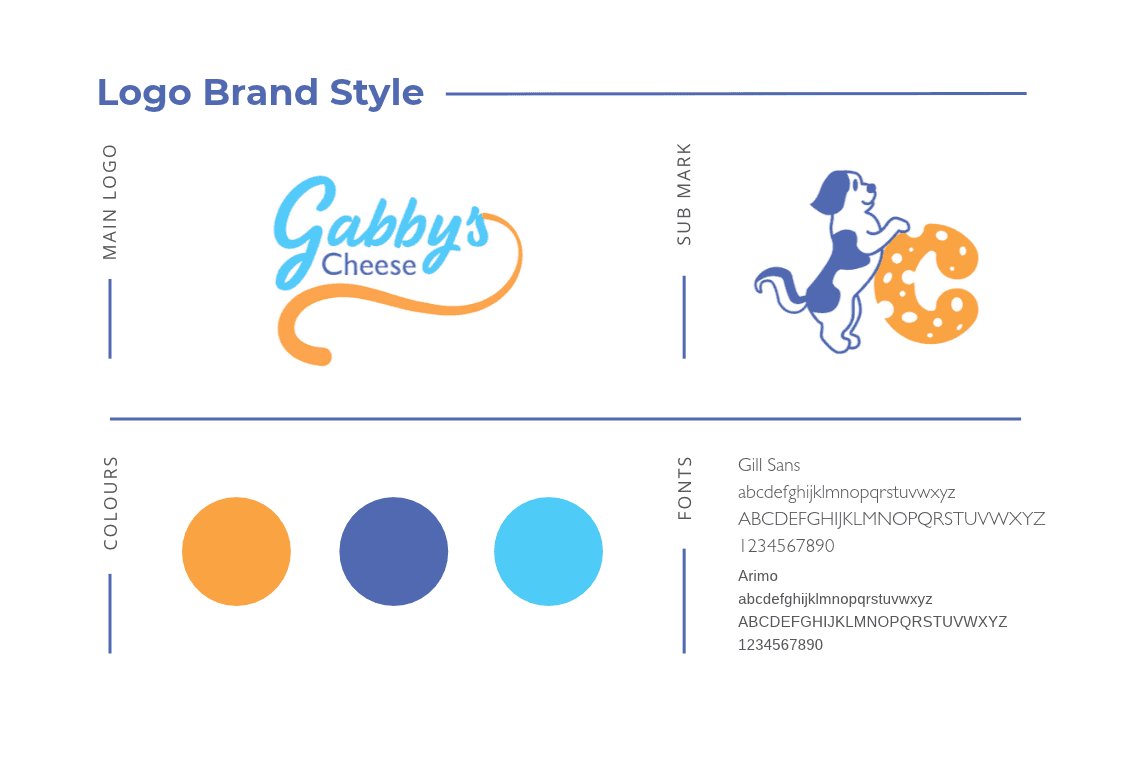
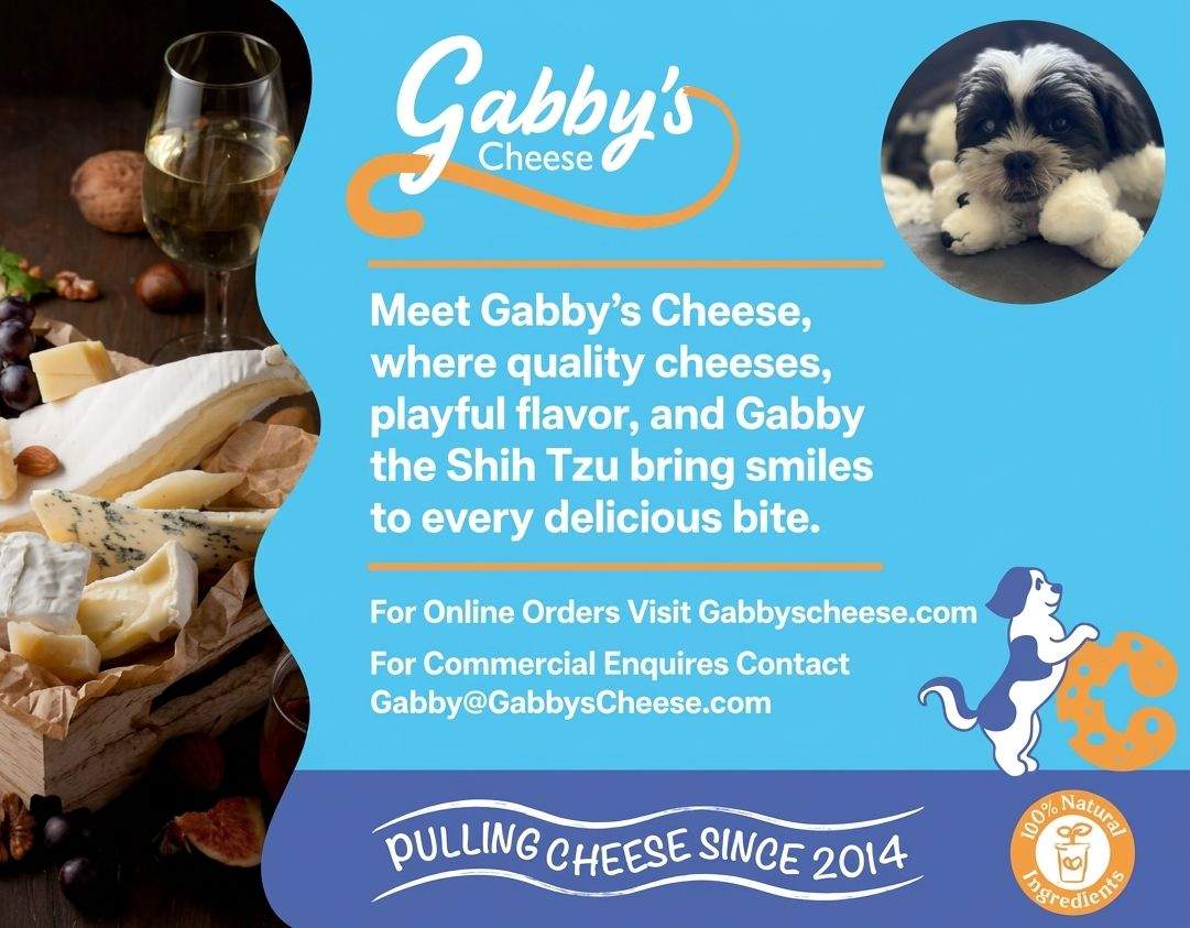
Gabby's Cheeses is a brand I created as a course project, built around our mascot Gabby, a shih tzu, with traditional families as the target audience. The concept centered on making a cheese brand feel warm, trustworthy, and approachable rather than corporate or generic. The goal was to develop a full brand identity from the ground up, including packaging, as a comprehensive branding exercise.
02 — Creative process
I started by shaping Gabby's personality first, since she was the anchor for the whole brand, then built out the visual identity (logo, colors, packaging) around that personality. Every design choice was filtered through one question: would this feel trustworthy and approachable to a family shopping for everyday groceries? I also made sure Gabby's presence stayed consistent across every touchpoint, from the logo to the packaging, so the brand felt cohesive rather than disjointed.

03 — Results & Lessons
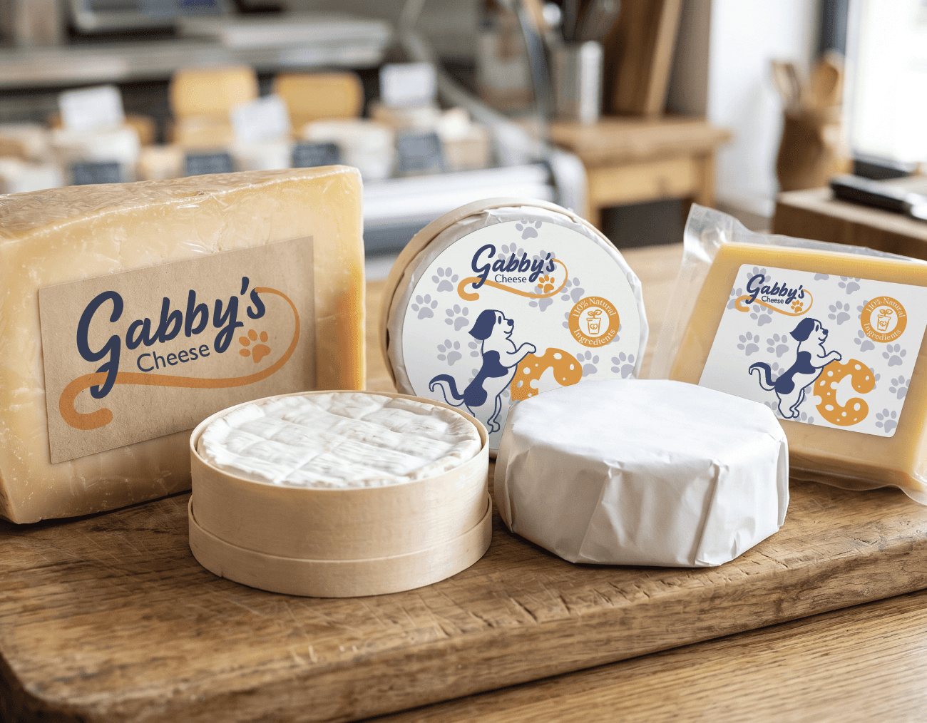
Results: Delivered a complete brand identity, from mascot to packaging, that felt cohesive and ready to present as a real product on a shelf. The final packaging and branding worked together to tell a clear story at a glance, which is exactly what a product needs to do in a crowded grocery aisle.
Lessons: Learned how much a single, well-developed mascot can carry an entire brand's tone and recognition, and how packaging decisions need to reflect the audience's values, not just look visually appealing.